Stephen’s portfolio / Opta Live
Type
Product
Year
2025 - 2026
Design team
1
Role
Product Designer
Skills
Product Design
UX Research
Information Architecture
Interaction Design
UI Design
Design Systems

The redesigned Stream — search, layered filters, and a clear card system for parsing live insights at a glance.
CONTENTS
Opta Live is a live sports research tool that lets broadcasters, researchers, and analysts follow a match in real time — surfacing statistics, graphics, AI-generated insights, and notes from our internal research team (HelpDesk) as the game unfolds. It replaced the legacy Live Monitor tool following the STATS/Perform merger.
By the time I took it over, I had already established Opta Search. Opta Live, by contrast, had been on the wayside — no recent updates, and drifting further from Search in look, feel, and flow. My job was two-fold: bring Live back into alignment with Search so the two felt like one coherent product family, and fix its most-used and most-broken surface — the Stream.
The Stream is the heart of Opta Live — a real-time feed of match events and insights. But under live pressure, it was working against its users.
I was the product designer for Opta Live. I joined after the product's initial launch and drove the experience forward — leading research, redesigning the Stream from the ground up, testing with live users, and aligning the product's components and flows with Opta Search. Some work was net-new design; some was refinement of what existed. The Stream redesign was mine end to end.
I validated the problems through a mix of methods: interviews with live researchers, usability testing, and — most valuably — observing users during actual live matches, when the pressure was real and the workarounds came out.
What I was watching for
1. How users coped when the feed moved faster than they could read — what they did when they lost the thing they were looking at.
2. How they distinguished one type of insight from another — or failed to — when every row looked the same.
The old stream had no differentiation between different insights, making it hard to scan quickly under pressure.
I rebuilt the Stream around one goal: let a user find what matters, instantly, without losing their place — even when the game is moving faster than they can read.
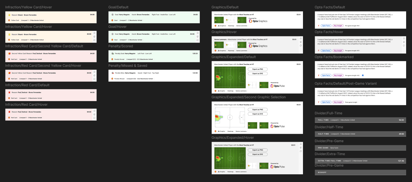
Anatomy of the new Stream

1. Search Bar - Users can jump straight to a player, team, or insight instead of scrolling back through the feed to recover what they lost.
2. Layered filters - Three tiers — Teams, Events (Goals, Shots, Cards, VARs…), and Content (Helpdesk Insight, Smart Insight, Opta Facts…) — let users cut the live firehose down to only what they care about.
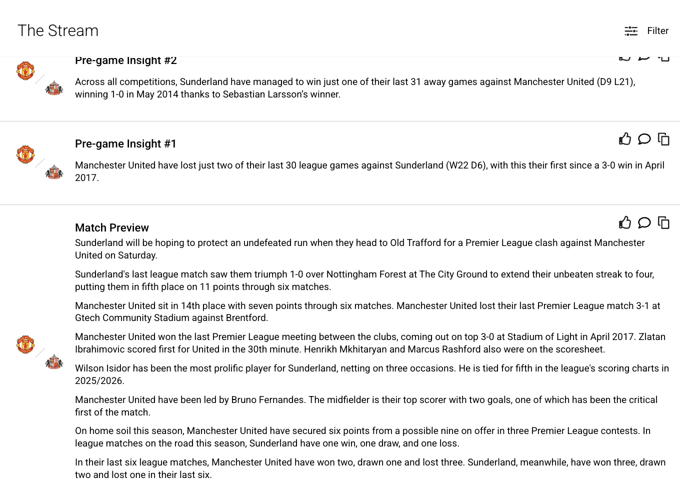
3. Typed insight cards - Every row now carries a clear tag (Opta Facts, Smart Insight, Helpdesk Insight) so users instantly know what kind of information they're looking at and where it came from.
4. Visual hierarchy - Tag components, bold type, team crests, and clear spacing give each row a distinct identity — a goal reads differently from a stat, one team's events read differently from the other's. See the below on this case studies for examples not found in the above image.
Beyond the Stream, a core part of my work was pulling Opta Live back into alignment with Opta Search. The two products serve distinct purposes, Search for deep post-game and historical analysis, and Live for real-time during the match. But to users, they're part of one Opta ecosystem, and they shouldn't feel like two different tools.
I aligned the component library, visual language, and core flows across both products, so that moving from Live to Search felt seamless. A researcher watching a match in Live and then diving into the history in Search now moves through one consistent, coherent experience.
Designing for composure under pressure
The most important lesson: in a real-time tool, the enemy isn't a lack of data — it's the speed at which it arrives. Good design here isn't about showing more; it's about helping someone hold onto the one thing that matters while everything else keeps moving.
Inheriting and unifying a product
Taking over a neglected product taught me that consistency is a feature. Aligning Live with Search wasn't glamorous work, but it made both products feel more trustworthy and easier to move between — which is exactly what high-pressure users need.
Other Screens
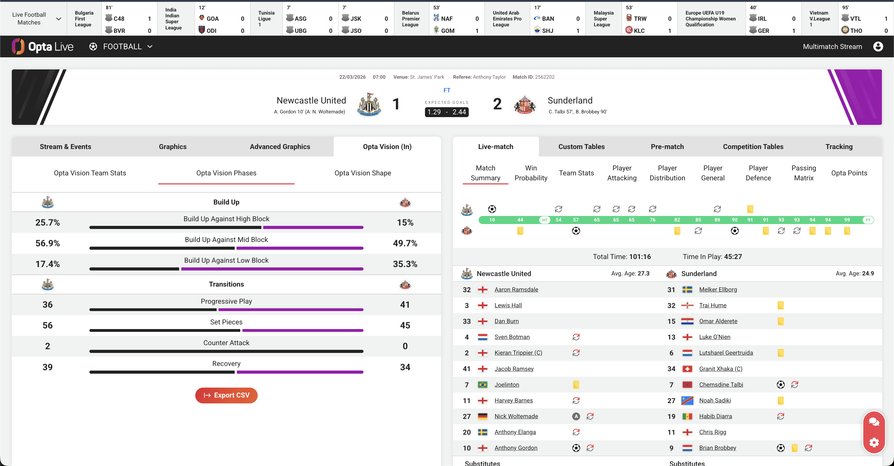
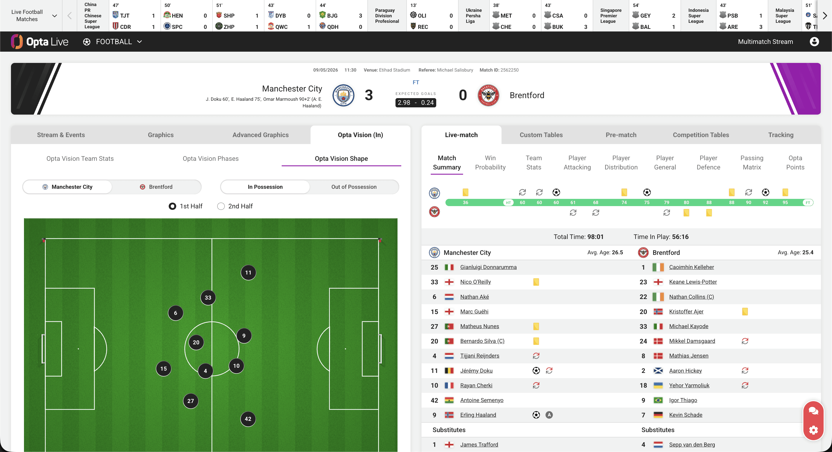
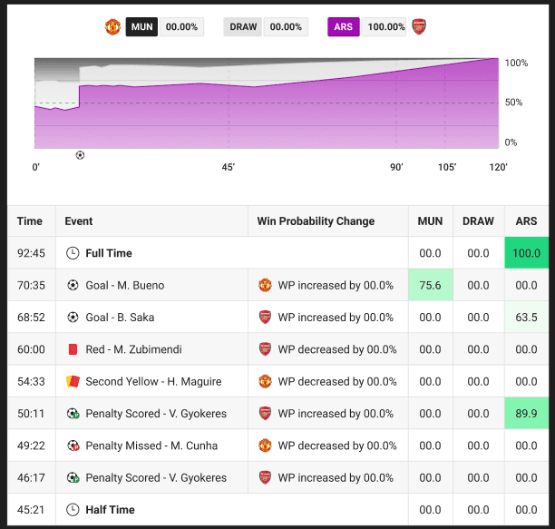
Below are screens found in Opta Live. Examples of The Stream and other components can be found. If interested in more examples, please reach out to me directly.