Stephen’s portfolio / Opta Search
Type
Product
Year
2022–2026
Design team
1
Role
Product Designer
Skills
Product Design
UX Research
Information Architecture
UI Design

Opta Search — a unified research platform built from two legacy tools, designed for the full match lifecycle.
CONTENTS
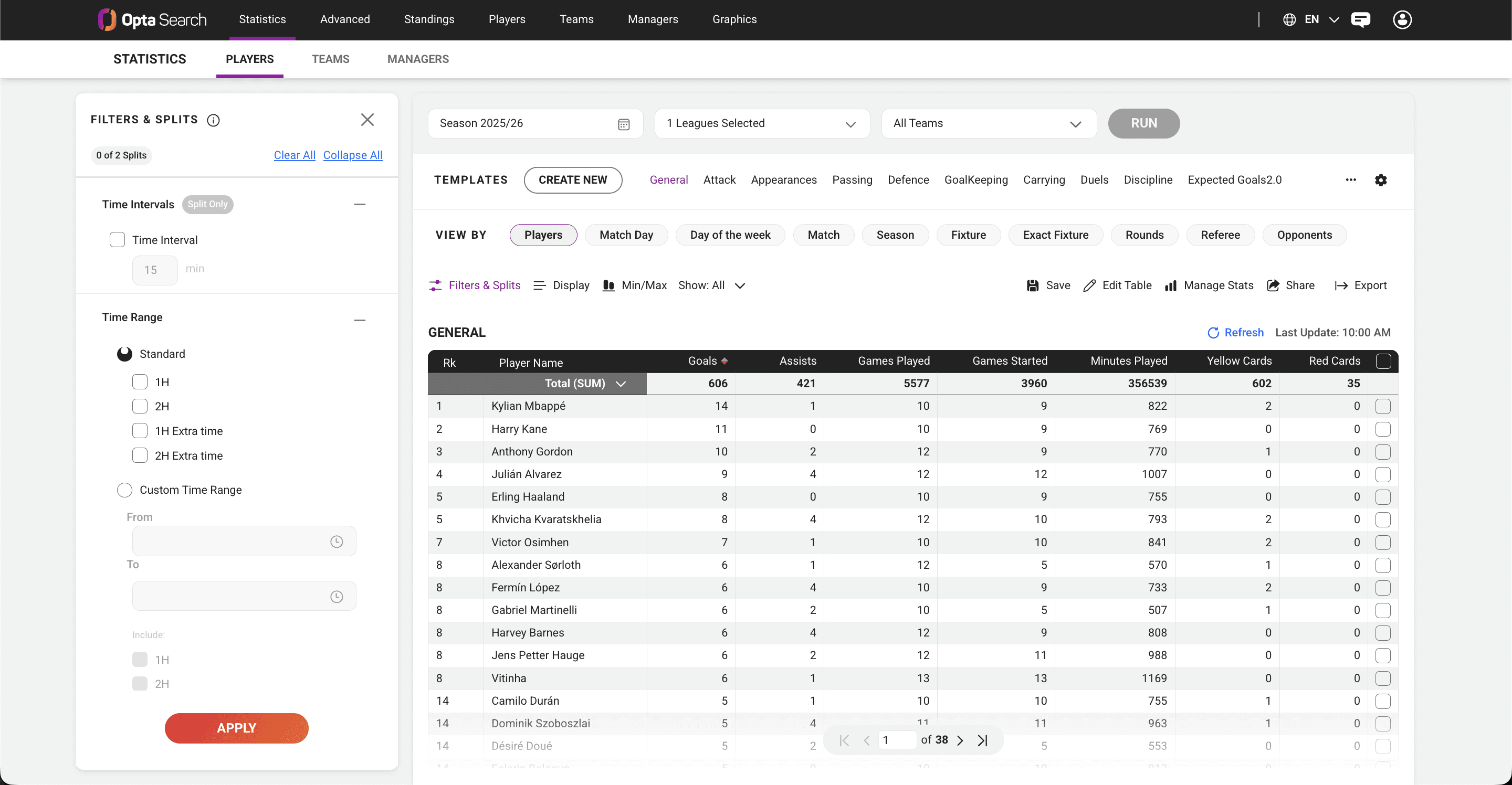
Opta Search is a sports data research platform built on one of the world's most comprehensive historical sports databases. It lets users query player, team, and match statistics across competitions: filtering, comparing, and surfacing insights for pregame preparation, live game context, and post game analysis. It serves both internal researchers and external clients, from broadcast networks and professional clubs to leagues and media organizations.
Following the merger between STATS and Perform, the company was maintaining two separate, aging research tools: StatsPass (American sports and football) and Query Tool (football only). Both dated back decades, were slow and visually outdated, and ran on entirely separate data models. With clients defecting to competitors like Sportradar, leadership prioritized consolidating both into a single modern platform, Opta Search, that preserved the best of each while serving a far wider range of users. I was the sole designer, from blank canvas to launch to three years of iteration.
Maintaining two legacy tools was expensive and unsustainable and the company was losing clients in the process.
Multiple user groups with both similar and differentiated needs
Two completely different user populations had spent years building muscle memory around two incompatible tools. The new platform had to serve everyone from expert data researchers to non-technical broadcasters, across pregame prep, live matches, and post game analysis, without compromising for either group.
I was the sole product designer on Opta Search for its entire lifespan, from blank canvas to shipped product to three years of ongoing iteration. My core team was a product manager, a product owner, and a team of engineers. Beyond that I ran my own research, facilitated stakeholder alignment, collaborated with SMEs, and tested directly with end users at client organizations. I owned the end-to-end design process.
Before touching Figma, I ran a full discovery phase, interviewing our internal research team (HelpDesk), auditing both legacy tools feature by feature, and analyzing support tickets and client feedback through HappyFox. What came back wasn't a feature wishlist. It was four non-negotiables that users had built their entire workflows around:
Four research pillars
1. Speed - Fewer clicks to get where they needed to go. In a live environment, friction isn't annoying, it's a failure.
2. Intuitiveness - Knowing where to go without thinking about it. Critical for broadcasters and pundits who weren't data researchers by trade.
3. Flexibility - Multiple paths to the same output. Power users wanted precision; newer users wanted simplicity.
4. Trust - Opta's data is the industry standard. Users cross-checked competitors against our data, not the other way around. The interface had to feel as authoritative as the data behind it.

One of the earliest and most consequential decisions was acknowledging two fundamentally different user types, and that designing for one at the expense of the other would sink the product.
Super Users were HelpDesk researchers (internal users) and experienced data analysts. They'd spent years inside StatsPass and Query Tool, knew the data models, and were skeptical of anything that simplified away the control they relied on.
Basic Users were broadcasters, pundits, and commentators, people who needed a compelling stat quickly and didn't have time to learn a new tool. For them, the interface had to get out of the way entirely.
The solution was a tiered experience: an approachable default state with progressive disclosure for advanced functionality. Same tool, different ceiling depending on who was using it.
The most revealing insight came not from what users said, but from what they did.

This single behavior shaped the two most impactful features I built. In the above image, you can see the legacy tool, QueryTool, and that there existed no templates or save option.
1. Templates & saved queries - let users save their full query setup and return to it instantly, before a match, during a match, weeks later. The fragile tab-hoarding habit disappeared.
2. Shareable URLs - captured the entire state of a query, inputs and outputs, in a single link. A researcher in a broadcast booth could send a colleague the exact data they were looking at in one click, critical when a producer needs an answer in 60 seconds.
A unified platform built around how researchers actually worked. Each major decision traced directly back to one of the four research pillars:
1. Templates & saved queries - addresses Speed + Flexibility
2. Shareable URLs - addresses Speed + Intuitiveness
3. Tiered experience for two user types - addresses Intuitiveness + Flexibility
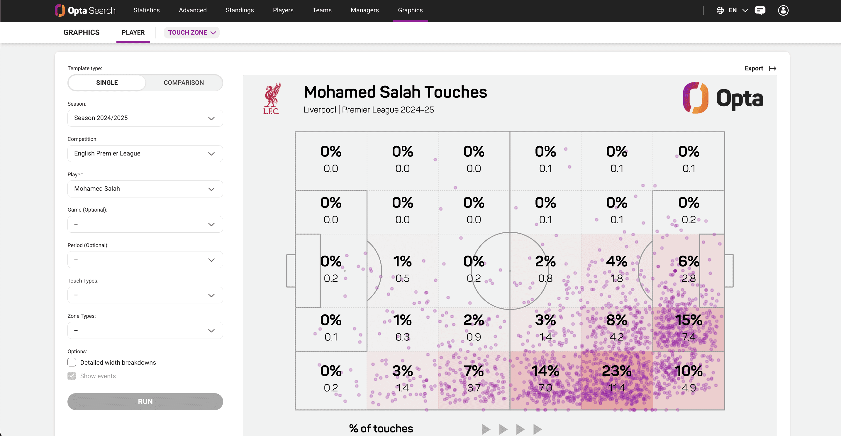
4. Advanced IRC features made accessible (streaks, with/without, comebacks, blown leads pulled from the Internal Research Center) - addresses Flexibility + Trust
5. Visual credibility & data integrity - addresses Trust + Intuitiveness

Designing for behavior change, not just usability
The hardest part wasn't the interface, it was helping users let go of workflows they'd relied on for years. Adoption is a design problem, and showing users their own feedback reflected in the product is the fastest way to turn skeptics into advocates. The HelpDesk team that resisted early became the product's strongest champions.
Working within technical constraints
Many features that looked simple required significant backend alignment across separate data models. Involving engineers early before falling in love with a solution, saved countless hours of rework.
Owning the full lifecycle solo
As the only designer, I advocated for users in rooms dominated by business priorities, managed scope with my PM and product owner, and learned when to push back and when to adapt. Three years in, the product I built from scratch was still running, still growing, and still being iterated on.
Looking ahead
The HelpDesk team that initially resisted the tool became its strongest advocates, a shift that happened not through persuasion, but through evidence. Their feedback truly shaped the product. When they saw their own complaints from Query Tool showing up as solved problems in Opta Search, skepticism turned into ownership. They became our greatest allies and advocates in improving and iterating on Opta Search.
Three years later, the product I built from scratch is still running, still growing, and still being iterated on. It's a product that I'm immensely proud of and forever grateful to the team that supported and worked on it alongside me.
If I could do one thing differently I'd push for a dedicated onboarding experience from day one. Looking back, the users who struggled most with the transition from StatsPass and Query Tool weren't struggling because Opta Search was hard: they were struggling because nothing was guiding them through it. We assumed that a better product would speak for itself. And largely it did, but that first session matters more than we gave it credit for. A thoughtful first-run experience, even something simple that walked new users through their first query, would have shortened the adoption curve significantly and taken some pressure off the HelpDesk team and our users during rollout.
Other Screens
Add a short paragraph here to introduce these additional Opta Search screens and the workflows they help illustrate.